Coldplay - X&Y

My first reaction to this album cover is
that I quite like it because it is quite simple yet colourful on such a dark
background and that I have found out that the cover design was done by a
graphic design duo formed by Mark Tappin and Simon Goften, calling themselves Tappin
Gofton. It is a graphical representation of the Baudot Code, an early form of
the telegraph communication using a series of ones and zeros to communicate.
The name of this band is Coldplay and they
make the genre of music is Alternative Rock and would appeal to people who
enjoy Rock music or wouldn’t mind listening to Coldplay to try something new and also people who also enjoy listening to Coldplay on a daily basis. The use of the code on the front cover is just a little snippet of what could be on the inside and on the inside is the Alphabet, ranging from A-Z and 0-10 and also symbols like '&' and a small selection of others.
The use of the Alphabet on the inside, spread over two pages, is used to decode the code on the front of the album book cover and then the inside front page and back page. They all could spell something totally different but the front one spells out the name of the Album 'X & Y' I would actually enjoy to try and decode the three/ four codes that are used.
The Shins - Chutes Too Narrow


Blur - The Best Of Blur


The use of the Alphabet on the inside, spread over two pages, is used to decode the code on the front of the album book cover and then the inside front page and back page. They all could spell something totally different but the front one spells out the name of the Album 'X & Y' I would actually enjoy to try and decode the three/ four codes that are used.
The Shins - Chutes Too Narrow

The Shins are an American Indie rock band, also linked with alternative rock and dream rock. This CD cover has a 'doodle' like to it, childlike and could link back to the childhood of the people who it's aimed at. Also, it had a 70's look to it giving it a slightly retro look to it. Also the look given via the cover is a scene of a sewage/ industry plantation which aids the name of the album "Chutes Too Narrow" which shows the tubes are very skinny and this also shows that they could have been hand drawn. The target audience of this album cover could be people who already listen to this band and also possibly new people who listen to Alternative rock or Indie rock mostly. If they don't look at the cover, then the CD would just be aimed at those who listen to the band a lot and don't mind what sort of cover they have.
When looking inside the cover, there are the lyrics to the songs that are features on the CD itself and there were also scribbles over many words because it shows progression from the different ideas for what the band are trying to say. On the inside of the cover there are many pictures that link to the lyrics that the band are singing and also the pictures could have different meanings to them. Also, the backside of the cover, it is a continuos picture and this therefore doesn't have a stop point. This then doesn't break the flow of the image.
To create this sort of cover, the designers could have used a professional program like Adobe Photoshop or Illustrator or something that is similar to these sort of programs.
Personally, I like this cover because it has a childlike approach to it and it's creative and it would probably catch my eye if I was to be looking in the shop for something new to listen to and it would make me curious to see what sort of songs they sing and wonder if they are going to be a good band.
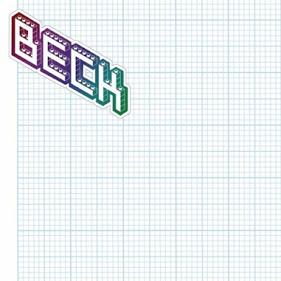
Beck - The Information
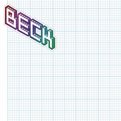
The band who has this cover is called Beck. Also, the way that they designed this CD cover is interesting because instead of actually desinging one, they have put stickers on the inside for the buyers of the CD to decorate their own cover. It really isn't the most interesting covers to look at because it is only Graph paper, which could remind people of the old fashioned graph paper that they could have used at school for Maths lessons or aiding their drawing. This also gives the people who buy this CD the opportunity to create something that they can relate to or something that they would enjoy to look at at they got out the CD to put into their player. It would be something that would ideally suit everyone but I think that this idea has been marketed wrong because it wouldn't generally appeal to the main target audience as they wouldn't know what to do and they could just end up letting their kids (if they have any) rip it apart. It also generally appeals to those Becks' fans as it relies on their understanding on what to actually do.
Personally, I actually like this idea of being able to decorate the cover as you see fit and how it would suit your own way of designing what you would like to see on your own shelf, although I think this idea has been marketed wrong because people would just glance over it because there is nothing on the back, it's just a sheet of graph paper.
The Chemical Brothers - Push The Button

The Chemical Brothers are a big beat dance group who aim their songs at people who are into Big dance tracks. The front cover is made of Typography (Push the button) and the words are used as a squiggle for the brain. The first also helps form the brain and it balanced on a tower of bricks. This is a similar construction to Russia where it's symbolises power and it doesn't use many colours because power tends to not use many colours because you don't want to put people of when trying to gain power.
The Bricks remind me personally of a chess piece (The Castle) which then shows that the fist is coming out of the top of the tower of the castle and therefore shows strong power. However, there is cracks in the wall to show deconstruction and destruction within the walls of power and the walls of the building.
On the back of the CD cover there are the song lyrics which are placed around the design of Cogs, showing the mechanics of the songs and maybe what they are trying to say what their songs mean about power and maybe about Communism. In addition to the songs that are on the back of the CD itself, they are also listed on the inside of the cover, to make sure that no one forgets their songs, especially since they are in big letters. This could just be to make them more easy to see an many people don't look on the inside cover so it could come as a shock to them when they see a list of songs on the inside as well on the back as the back cover is where generally people look at mainly to see what good songs they have on the CD. The designer is unknown.
Personally, I don't like this Cover because it is too dull for me because there are no colours to the cover and I like to look at something that would capture my eye as soon as I look at the self for CD covers. It was

This album cover is for the Band Blur and represents the sound track of The Best Of Blur. This band is an Indie, alternative rock band and would most likely appeal to this sort of area and the many Old fans that are still around and remember this band. The cover is designed by an Illustrator called Julien Opie and in the style of Pop Art, with the four band members cartoonized and simplified in a way and also, they have been put on different backgrounds. The name of the band has been placed into the middle of the page and also the name has been embossed.
This sort of design is a nice simple one to do yet effect because you can combine different images into one and also it is a effective because you can put different personalities into one cover and it would all manage to fit into the same sort of genre because the cover helps make it work. This is also would make it stand out on the shelves because modern covers have REAL pictures of the bands/ artists on the front and this just makes it stand out because generally artists like to be at the front in the limelight instead of being personalised in a 'cartoony' sort of way.
I like this design because of the simplicity it has on it and also, I like the way that it's just four pictures and that they are the same size. It is also simple because of having a really simply font in the middle of the CD cover, yet it works well because of the style of the font being a curvy sort of text.
Tokio Hotel - Scream

The album is Scream by Tokio Hotel who are a german band but do their songs in both English and German. Also they are a alternative rock band and I found them through a friend who was a really big fan of them and she introduced me to their music. I could not find out who designed this cover but if I was to look at the cover properly, I could possibly find out from the list of credits that are on the back cover. This cover could have been created by using a professional program that could help incorporate the cover come together.
By using a professional program, the designer could have taken a photo of the band in a specific pose and then take that, then using the pen tool to outline the band or the magic wand tool to take out the background in the other picture and then Copy and Paste the band into a ready done background with a lens flare sort of effect in the background and then made the text in the foreground with the bands logo and the word Scream with a light effect.
This is a really nice effect to do because it's simple and it could just mean a sort of layering issue with two completely different backgrounds and bands used. For example, if I was to do a album cover using this idea with Ed Sheeran, I could get an easy picture to do, like cut him out or using the magic wand tool, I could then get a picture or a simple background with a nice pattern on it and then paste Ed onto this layer and then editing and styling the picture to how I think that it should look.
I really like this way of styling and it works really well for different types of music and I would certainly give this way of doing a CD cover a try and see what the outcomes are.
No comments:
Post a Comment