Project Brief:

This is our given project brief for Summer of Sound CD project. I don't know what to think about this brief because I am not really good at designing things and I may end up struggling to do something but I have some ideas on what I want to do for this CD packaging.
CD Sheet and Idea:
The artist that I am going to do is Ed Sheeran with his song 'Drunk'. I enjoy listening to Ed Sheeran and many other artists but was really focused on doing something for Ed Sheeran so I've decided on an artist instead of a band or doing a mixed tape. This should be fun because I can always link back to Ed's music video for 'Drunk' with the cat that really doesn't talk and take inspired ideas from that.
My targets for this term in Graphics is to manage to get all my work done and handed in before deadline dates and also have more enthusiasm for projects because in past projects I have not had loads of enthusiasm for topics or tasks at hand and I then in turn have lost the interest in doing them.

CD Sheet of our chosen artist.
Here, I have chosen to use Ed Sheeran as my chosen artist as I enjoy listening to him and I am more or less always singing the words to his song "Drunk" when I am sitting alone or just casually without my own iPod and I start singing his song. So I want to design 'Drunk' a logo because I enjoy it and many people enjoy his music.
I didn't get many things because it's hard not to think of the song's video already when I am jotting down ideas that just come to me because Ed Sheeran's colour at the moment is Orange and he has the small cat paw logo so it's really hard not to think of the video for it. But it was a challenge that I enjoyed. Maybe if I thought on it more and jotted down the ideas that I had, then I would find more things to do on this single. I would deffinatley enjoy doing research and designing for more songs of Ed Sheeran.

Our logo research sheet
This logo research sheet is to show us the selection of ways we can do our own designed logo to do with our chosen band/ artist. I prefer the Apple brandmark because it is something that everyone knows yet it is quite simple. It is very well known though because of the many products that are sold by the company 'Apple'.
The abstract mark of Nike (the tick) is interesting because I can relate that mark to Ed Sheerans logo of '+' and how that doesn't make sense or represent the whole idea to his album of '+' which includes the song that I have chosen to do. Seeing these, I have had the idea to maybe do a Brandmark or wordmark because I can use a technique that I have learnt in lesson to combine the idea of 'Drunk' with the way that I can do the typography.
Logo Ideas on Illustrator
These examples that I have done above, are done by following a tutorial. I found that doing most of these to be challenging for me because of the steps and how many times I had to go back and replay the little bit of information that I missed. The tutorials sometimes went too fast for me to keep up, which had me going backwards and forwards but this is alright because in the end I learned the tutorials and maybe I'd go back and re-do some of them to make them better.
 |
Shapes
|
The techniques, however are really interesting to do and learn the techniques to maybe practice at a later date. First of all, I listened to the first tutorial and I learnt and extended my knowledge on how to separate shapes from the main shape, like divide from path line and separate the objects. Also, it is also a nice way to experiment with different shapes and different ways of combining them to make something new and experimental. I would use a few of these ways maybe to create something fun to look at. Maybe if I wanted to do something for my final project, that wasn't to do with my logo, I could use this way because they are many different ideas that could be done here.
 |
Reflection
|
The second technique that I managed to complete, didn't turn out really well because I may have missed out a step or just didn't complete the tutorial because I was glad to have reached the point that I finished anything hard. This tutorial was hard to do because of how many steps for this process which were sometimes not clearly explained. If I did this again, I would choose something more simple to do, maybe work with one letter and if I get that, then I would go on to do more letters and possibly other things because that way I have practice on working with this tutorial and I can always change the tutorial around to suit what I wanted to do.
 |
3D Logo
|
The third technique that I did was quite fun to do and when I finally finished it, I was really proud of the outcome because of the fact that I really like the colours and the ideas that came to my mind for this and that I could really use this for my final logo, if I changed the main colours for the 3D looking circle. I also think that this one looks more professional (if I changed the colours) and that I would really enjoy doing this tutorial again, even if there was music and that I had to keep going backwards and forwards for steps that I had missed or didn't understand.
Shiny Text Wording
|
For the shiny text word mark tutorial, I quite like the effect that is given because of how the colour can change really easily with just an outer glow, from colour to a similar colour and that this gives of an image of a light passing over the word, through the middle, and that I really liked doing this one. Maybe, if I was to do this again, I could possibly use two completely different colours to see what the effect comes out like and if it doesn't work, I could simply revert it back to two similar colours instead.
Hand drawn Logo Ideas
 |
| Guitar inspired logo |
 |
| Using shapes |
This shape is a straight edged shape irregular hexagon and I quite like this idea for a logo but it this would be slightly hard to do because of how it is made and it's something different than to a regular shape, but I would have to try and relate it to Ed Sheeran. I think he'd be a regular shape type of person and I don't know if this sort of logo would suit his music. I did like trying out this shape and I think for any personal work that I do, I would try and incorporate this into the work.
 |
| Continuous line drawing logo |
 |
| Another shape drawing |

I think that this logo is good because the lines are going the same way as the rest yet the lines don't look right because they're not all the same length so in a way I don't like it because it doesn't look tidy enough to be a good enough logo. Also, it would take a long time to colour in because I would have to select each individual line to colour in and make them look the same size.
Moodboard and Mindmap

Artists: 3) Si Scott packaging for perfume , 4) Si Scott Papercutting in a form of a butterfly , 5) William Hatch Crosby painting over a photograph
Colour: Red, Orange, Blue
Lyrics: "Drunk" - Ed Sheeran, "You need me, I don't need you" - Ed Sheeran, "The A-Team" - Ed Sheeran, "Small Bump" - Ed Sheeran
Tecnhiques: Typography Portrait, Acrylic painting,
----------------------------------------------------------------------------------------------------------------------------------
Here is my moodboard on CD Packaging. I think that I have a pretty good idea on what I want to do and I think that if I plan it right, then it will turn out how I planned it in my head. I especially want to use the idea of making a guitar into the packaging maybe just to do something different and to stand out on the shop. Also, it would relate to Ed Sheeran alot because he plays guitar and it's acoustic. Also, I want to use the paw print to help influence my work because it is his main logo really and it reminds me of the Cat which is why I have a picture of a cat on my moodboard.
 |
Mindmap of ideas
|
CD Packaging Analysis


Background Designs
 |
The first Bokeh design I did
|
 |
Bokeh
|
 |
Ed Sheeran Style Wallpaper
|
 |
Wallpaper Style
|
 |
Bokeh Style - Jump
|
 |
Bokeh Style - Ed Sheeran
|
Evolved Logo Ideas


These developed logos are my final choice and it's something that I think that worked really well and I think that it suits my chosen artist well. It's something different to what he has now and I like the idea of having it in a shape because it helps keep it under control. I think that the final product will be interesting to see and the colours used here represent Ed Sheeran well.
Net

This is my original CD net that I want to use for my CD packaging because it seems interesting, yet also it looks complicated to fold but I will have to practice folding it up just on paper. This way I will know if it fully works or I have to make slight changes to it.
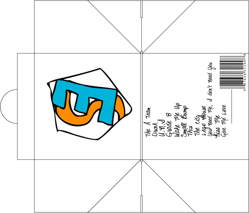
Inlay


These inlay designs take up a lot of space but I think that it wouldn't all fit on the page otherwise because it has to make sense/ have all the song lyrics on it. I like the typeface of the booklet and I originally wanted it to have just text on it but I have also put up a inlay that has a small image in the corner that is the logo that I have designed. I think that this could not work because it may crowd the page too much and not work as well as I thought it would work.
Change of Plan/ New outcomes


These inlay designs work better because it saves paper and the layout is structured. The font is also smaller, therefore being able to save paper and being able to have two sets of lyrics on each page.
I kept the inside of the inlay white so there wouldn't be too much orange for people to have to look at and it differs from everything else. It also helps peoples eyes not have to strain.
The orange front along with the orange back is simple with the shoulder on the front, next to a "+" sign which also represents his album

I think that these outcomes have been more successful in design because the simpleness of the front design (which is Ed Sheeran) across and then that's it for the front so you have to open up the packaging to see what's on the inside and you have to open it up anyway to get the CD out so you can listen to it.
I think that the orange colour works better because it relates easier to Ed Sheeran.
Evaluation
Overall, I think that my change of course has led to a new and better outcome because the whole thing being in orange helps represent Ed Sheeran more and it's rather a simplistic outcome. Also, my designs and progress throughout this course has helped me find the new outcome. I changed this because I felt that the white version originally didn't work well and every time I cut in the middle, the CD would fall out so if that was going out on shelves, the CD's could be easily nicked without any one knowing and then I would be blamed. It is a design fault therefore I am going to ignore the cut in the middle and just leave it as a fold in the middle.
The images used are mainly from the internet because I wasn't able to get to an Ed Sheeran concert to get any good images of him, however I used my own techniques on them to enhance them. I think that my techniques are rather simple, yet I think that clipping masks and text images are something that work well for the texts.
If I were to do this again, I probably would put more care into choosing/ making a really effective packaging net for my CD because I don't like the way it had to fold together in the end because it was really complicated with the side folds having to be folded in a specific way to make it work.
I have not used a paw print, even though that was the original image for Ed Sheeran, because I wanted to do something different because I wanted to change it up a bit and see what I could create to represent Ed Sheeran, instead of a simplistic paw print.
No comments:
Post a Comment