 |
| This is the brief that I have chosen to go with for my Exam Project |
This is my mindmap, just drag it around and you can see the different parts of it and see what different things I have included on there.
The book collection that I am more likely to going to go with is The Demonata Series by Darren Shan, or something similar in genre, because as I have been reading them lately I feel like I could do a really interesting book jacket for the series in Minimalist style. I chose this book collection because I wanted to do something other than the suggested books and I feel that if I do something that I know more about then I am more likely able to com up with more ideas that are different to each other and can portray the books on the inside and show what they are about.
Igor Udushlivy
 A Graphic Designer and
Illustrator created these two pieces. Igor Udushlivy, who combines Graphics
with Sense and he also, creates Logos, Logotypes and Illustrations and he has
different outcomes. He has more than 100 projects in his portfolio. These pieces of work are Book covers combined
with Bookmarks. I chose these two because I have chosen to do a brief to create
a series of book covers for a series of books. I think that his outcomes are
really interesting yet minimalistic and it really represents what the book is
about. For example, Robin Hood is about a guy who gets kicked out of where he
lives and he becomes a really good archer, shooting things in the wild to
survive. Therefore that is why thee is an Apple and an Arrow. The Sword and The
Stone is really simple to explain as it’s about Arthur who becomes the King
because he is strong and the sword is magical where you have to be able to pull
out the sword if the sword is destined to belong to that person who manages to
remove the sword from it’s stone setting. The idea that the extra bits, the
Arrow and the Sword, are used as bookmarks is a really clever idea because then
it then becomes an interactive book. Where the reader has to remove the bookmark
from where they had left from when last reading and this becomes interactive
from when they are pulling the sword out of the stone, so they feel they have
rewarded themselves with becoming king/queen or they have become Robin Hood
from when they pull the arrow out of the book. Then they have to put the
bookmark back in, leaving the imagination and the mind-set of the book
characters to the next time they have to take out the bookmark and they a
fictional mind behind and that they leave it for someone else to use and become
immersed in the book themselves.
A Graphic Designer and
Illustrator created these two pieces. Igor Udushlivy, who combines Graphics
with Sense and he also, creates Logos, Logotypes and Illustrations and he has
different outcomes. He has more than 100 projects in his portfolio. These pieces of work are Book covers combined
with Bookmarks. I chose these two because I have chosen to do a brief to create
a series of book covers for a series of books. I think that his outcomes are
really interesting yet minimalistic and it really represents what the book is
about. For example, Robin Hood is about a guy who gets kicked out of where he
lives and he becomes a really good archer, shooting things in the wild to
survive. Therefore that is why thee is an Apple and an Arrow. The Sword and The
Stone is really simple to explain as it’s about Arthur who becomes the King
because he is strong and the sword is magical where you have to be able to pull
out the sword if the sword is destined to belong to that person who manages to
remove the sword from it’s stone setting. The idea that the extra bits, the
Arrow and the Sword, are used as bookmarks is a really clever idea because then
it then becomes an interactive book. Where the reader has to remove the bookmark
from where they had left from when last reading and this becomes interactive
from when they are pulling the sword out of the stone, so they feel they have
rewarded themselves with becoming king/queen or they have become Robin Hood
from when they pull the arrow out of the book. Then they have to put the
bookmark back in, leaving the imagination and the mind-set of the book
characters to the next time they have to take out the bookmark and they a
fictional mind behind and that they leave it for someone else to use and become
immersed in the book themselves. The materials used here look to be strong yet flexible white card
with the illustration is printed on top if it. The extras seem to be also made
out of strong white card that is easy to cut and manipulate. For the designs, I
think that they were made digitally but they could have also been handmade, from
the scratch marks that are on the text but that could be something that look
could have also been done digitally because for The Sword In The Stone text, it
suits the idea of the stone and it relates to the book itself. For both books,
the colours are completely different but it suits the idea behind the books
themselves. For the green of the apple, the green is really bright to signify
the freshness of the apple itself and I think that this works but for The Sword
and The Stone, I think that the colour of the stone is too close to the white
of the background so it could be hard to read whats on the stone itself because
if you look closely enough there is writing on it and it says something close
to “Who so pulleth this stone out of this stone…. Can become the King Of England”
The materials used here look to be strong yet flexible white card
with the illustration is printed on top if it. The extras seem to be also made
out of strong white card that is easy to cut and manipulate. For the designs, I
think that they were made digitally but they could have also been handmade, from
the scratch marks that are on the text but that could be something that look
could have also been done digitally because for The Sword In The Stone text, it
suits the idea of the stone and it relates to the book itself. For both books,
the colours are completely different but it suits the idea behind the books
themselves. For the green of the apple, the green is really bright to signify
the freshness of the apple itself and I think that this works but for The Sword
and The Stone, I think that the colour of the stone is too close to the white
of the background so it could be hard to read whats on the stone itself because
if you look closely enough there is writing on it and it says something close
to “Who so pulleth this stone out of this stone…. Can become the King Of England”
Both pieces of work aren’t that big in the middle of the page, but
they are big enough to be seen on bookshelves in stores. The images aren’t big
so they don’t detract from the titling of the books themselves and also, the
bookmarks vary in size, depending on book so they can still be tucked inside
the book itself and I think that the sizes work very well and according to the
size and length of the title works with the use of imagery even if it’s simple
small things such as a Stone on the page and using a Sword as a bookmark.
I think that the designer, Igor Udushlivy, has been very successful in creating these book sleeves for different books and using different imagery that's very simple yet effective combined with using bookmarks that create these unique minimalistic outcomes. This work has really inspired me to create something similar when I come around to designing my final outcomes and I think that I would like to also create my own bookmarks to go alongside my final pieces.
Moodboards
 |
| Minimalist based mood board |
 |
| Genre based mood board |
This mood board showcases what book genres I would like to look at. As most of these books are Young Teen Vampire/ Horror Fiction, I think that my outcome will be something to do with this genre, for example Darren Shan and his books of Vampires or Demons, PC Cast and Kristen Cast's books of Vampyres. I wouldn't really do The Twilight Saga but it's still part of the Vampire Fandom so there is a chance that I could look at it for some ideas if I change my ideas to go away from previous ideas about using a different book collection. The Vampire Diaries could be possible to do, but from the mood board the book covers that I have selected are already quite minimalistic so I would have a hard time to design a new book cover that's small in detail. The reason that I chose these sort of books is that I generally read this genre anyway, wether it be about Vampires, Immortals or even Werewolves and I find this genre really interesting and it keeps me reading the book so it's all good publicity.
Chosen Book collection - The Demonata Series
Mindmap of Series
Risa Rodil
 This
work has been done by an Multi-Media designer called Risa Rodil and she is from
Manila, Philippines. She is quite young for a designer, being 19. She enjoys
creating websites, posters and creative illustrations. She also enjoys
incredible photo manipulations, clever typography and minimalist posters and
she finds that they fascinate her. This collection of artwork is to do with The
Harry Potter Series and she creates minimalist posters to represent the books/
films and what’s contained within. This
work was a personal project for her to see if she could create something
different for the collection. I chose
this piece because I think that the overall is really intriguing and I would
like to use these minimalist ideas for my own book covers.
This
work has been done by an Multi-Media designer called Risa Rodil and she is from
Manila, Philippines. She is quite young for a designer, being 19. She enjoys
creating websites, posters and creative illustrations. She also enjoys
incredible photo manipulations, clever typography and minimalist posters and
she finds that they fascinate her. This collection of artwork is to do with The
Harry Potter Series and she creates minimalist posters to represent the books/
films and what’s contained within. This
work was a personal project for her to see if she could create something
different for the collection. I chose
this piece because I think that the overall is really intriguing and I would
like to use these minimalist ideas for my own book covers.
I would associate this piece of work to the
genre of fantasy because of the use of the blue flames and the time turner and
because I know of the books that these are related to. I think that these
represent the fantasy genre really well and it helps people understand what’s
inside the books, even if there wasn’t any text. But to have no text would
require the designer to assume that the audience has already read the series,
Harry Potter. The theme is a mix between Harry Potter and Minimalism and these
two works very well together.
The techniques and materials used look like
they have been done on the computer and it’s mostly digitalized, mainly editing
and graphics program that allows you to draw with precision, something like
Adobe Photoshop or Adobe Illustrator. The use of colour is really effective as
the colour stands out from the images and the text font and colour are simple
and aren’t over done. They also don’t detract from the face value of what you
are looking at, therefore not giving the viewer too much detail to look at. The
pieces of work are a reasonable size to be posters, but they would have to be
sized down to make them more appropriate for front cover book sleeves. The fact
that all the images are centre is that it draws the eye into the middle and
then releases the eye after they are finished looking at it because the images
have something pointing in a different direction, like the sword is pointing
up and the flames have this two directions going on as the blue flames are pointing up (due to natural habit of fire) but there are these black flames on the inside which are pointing down, creating the spaces between each individual flame.
Primary Imagery


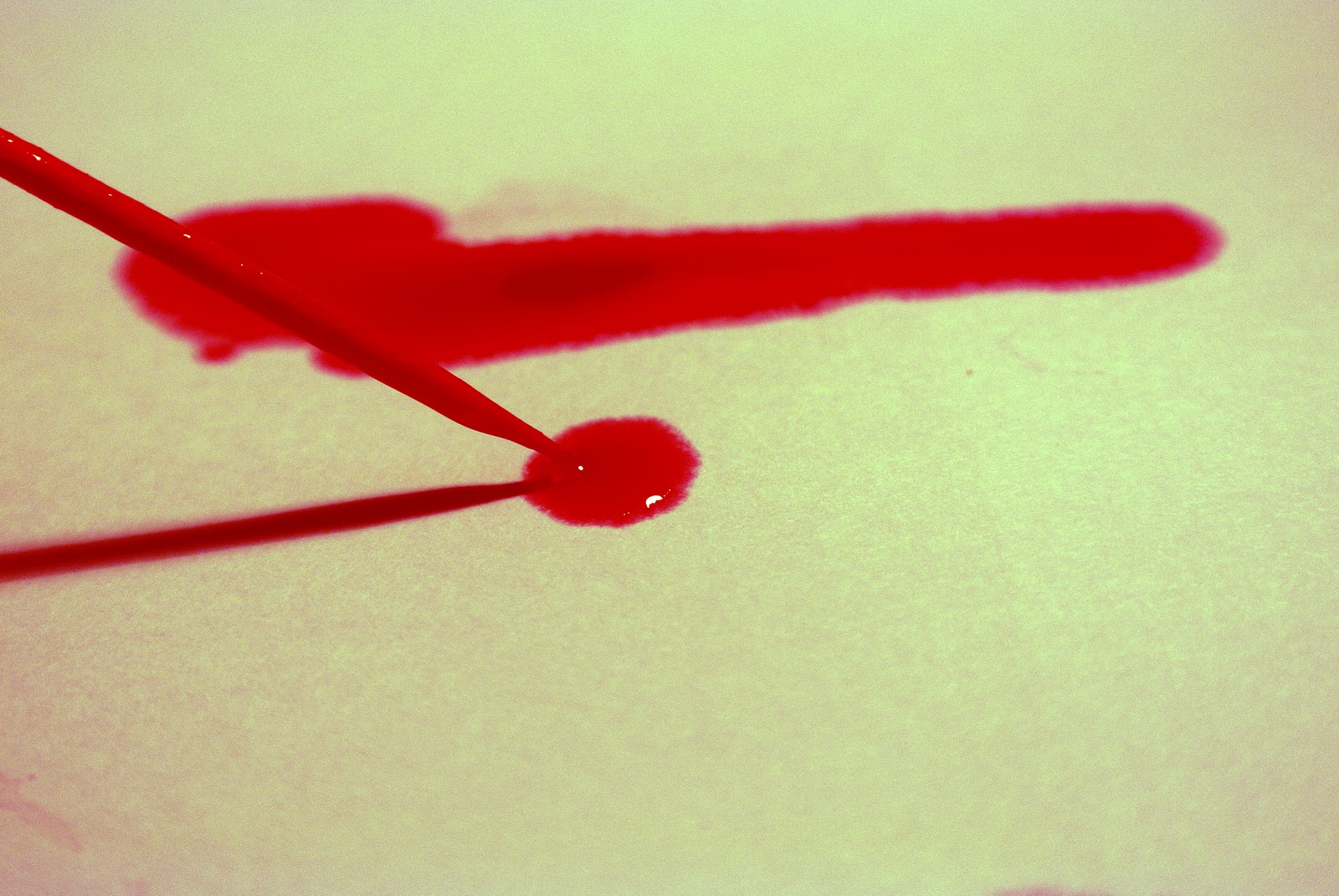
These are collections of my primary imagery that helped me start of with experimentation. I really liked how the ink and Egg timer images came out because of the way that the ink has dripped down the sides of the timer.
Primary Imagery


These are collections of my primary imagery that helped me start of with experimentation. I really liked how the ink and Egg timer images came out because of the way that the ink has dripped down the sides of the timer.
Digital Experimentation
Below are my experiments so far. I created these on Adobe Photoshop and Adobe Illustrator and therefore I was combining my skills for both programs. I also followed tutorials to create these but after that, I went on to use my own skills for digitally produced outcomes. I feel that these all turned out pretty well but I will go back and choose my preferred outcome and then go on to refine it. |
| Layering of Separate Layers |
This is the first outcome I produced and I used Adobe Photoshop to create it. I used 3 layers, but of the same image to create this 3 tone colour layered image. I took the original image into Photoshop and from there, I duplicated the layer 2 times and unlocked the background layer. I then inserted a white layer underneath Layer 0 (Background layer unlocked) The colouring was just a Cyan colour on all three layers, but this time the opacity on each layer was different. The outermost layer was darkest, coming down to in-between light and dark and the third and final layer being the lightest/ brightest. Getting the ovals was pretty easy because this is where I took the oval selection tool, and selecting the part of the image that I wanted to keep, I just selected that and made sure to select the inverse of the oval, before pressing the backspace button and getting rid of the surrounding areas to the oval I've just selected. I did this 2 times more to get this gradual/ selected colouring system but I don't know if I like it or not because of the effect as you can't really see the colour different between the top layer and the middle layer. I may experiment further with this though, using different colours and creating different shapes, effectively creating clipping masks of the shapes, keeping the image inside the shape the same, but different shapes within each other.
 |
| Layering of two different images, one in Grayscale and one in colour |
This outcome is interesting because instead of following the tutorial, I decided to explore the use of black and white against an image that had a filter of cyan. I used the oval selection tool to create this big oval, but had to make sure that both images would be the same size so using the Free Transform tool, I made the black and white image the same size at the bubbles and I think that it worked quite well. Although the images don't relate to one another, there could be a possible link to them where the bubbles have come from someone who's frothed at the mouth and then it's pooled around them and then the 'blood' images in the background could be whole cause. It's morbid because my theme is horror/ Teen Dark Fiction, but I chose it and I think that if I got more images that can lend themselves to my chosen genre, then I will be able to do a lot of more experimentation with them. I also used Adobe Photoshop for this outcome. I think that this meets the brief because there is two images within each other. I found doing this was quite easy because it was a simple thing to do and I would enjoy taking this experimentation further, like I said before, using different images of different things and seeing if I can find a way to relate them.
 |
| Typography created on Illustrator |
 |
| Typography created on Illustrator |
 |
| Digital experimentation using Colour Balance and Brightness/Contrast |
 |
| Brightness/Contrast, Colour Balance and adding another 2 pictures on top |
 |
| Lord Loss ghost typography |
 |
| Die, typography created in Illustrator |
 |
| Changing eye colour |
 |
| Changing image colour |
Exhibition Review - The Photographers Gallery.
On Wednesday 6th March, we went up to London to The Photographers Gallery near Oxford Circus. It was hidden away from the main street but we found it well. In the Gallery itself, there was many people exhibiting their work, for example on the top floor it was a group exhibition, where 4 people had their work on display. The top floor was Perspectives on Collage and one of the people exhibiting was Clunie Reid and she had this child-like aspect on Collage where she used Internet and Anime Manga style with a very pixelated look on things. I didn't really enjoy going to the Photographers Gallery for Graphics because of the simple fact that I didn't find anything that's sort of inspiring for me to look at for my ideas that I have. Apart from having the idea to do Minimalistic in an abstract way, Collage doesn't relate to my theme and I found that it did relate more to Photography. However, the practical that we did where we chose the style of College that we did and what styles there were of Collage. For example, you can use shapes such as Cuboids and squares and then you can place then next to each other to create this weird yet unique different outcomes. I've done this before for a past outcome, so I didn't feel like doing this again so I tried this technique which was where you drop the ripped or cut piece of paper and you glued it where it landed. Therefore, this was a rather spontaneous idea and it gave the mind time to relax and not overwork in thinking of where best to place bits and pieces.
Ideas?
I sketched out an idea that I had to do with the book cover itself and how I thought it all could be placed. The artist that has majorly inspired me for this was Heebok Lee because of his kinetic typography and how effective it really looks, especially for what I am aiming to create.

This is only a general idea for what could be done. I could end up changing this because it may not work and it may not 'fit together' like I have planned here.
Handmade Collage
 |
| Handmade collage relating to my book theme |


So far, I have looked at all these experiments and I think that I have preferred doing digital, but that's probably because I have enjoyed them more. I feel that I am more capable with digital and I have been able to use my own images to create these different effects and I have found different tutorials that I can use. The reason that I have chosen to go Minimalistic is because I think that one/ a couple of images that are centred in the middle of the page can 'expose' more of the book as there is a saying "A picture is worth a thousand words" where the image can convey what's inside the book itself. Also, I want to try and aim this book at those who like the horror/ thriller theme more and that are generally older because even though people are not meant to be choosing books based on covers, they still do. Therefore, the book covers of my chosen books, currently, are more aimed at Teenagers of a certain age group, such as 13 - 19 year olds but taking inspiration from what the designers of the Harry Potter Book Covers designed for the adult 'versions' of the book, I want to change up the cover designs for the Demonata Series and make them more convenient for adult readers. This could then help the selling of the books because they would then have expanded their marketing to older readers.
Experimentation for Typography.
Based on the nature of my books that I have chosen to do and their genre, I have to create something that links in well with that genre/ theme. I have used the title 'Slawter' (Book 3, Demonata Series, Darren Shan) to create something in Adobe Illustrator.
 |
| Slawter, two different colours |
I think that these outcomes are interesting and relate to the content of the book. I have also asked some of my friends to tell me which one they like best out of the two so far and the things that they have said is that they like the font of the bottom typography, but they prefer the top one for it's colour. This was the general feel to them, but as this was my friend group, they were aged 16-18 and therefore I didn't really get any opinions from my 'target' audience that I am trying to create these books for.
I will next ask some adults which one they prefer and why, then I will be able to take that information further with this experimentation as then it will help me figure out what sort of typography attracts adults.
 |
| Slawter, using a gradient colour green straight through the middle |
 |
| Slawter, two different options |
 |
| Hell knows no boundaries, Black and Red |
 |
| Hell knows no boundaries, Grey and Red |
 |
| Hell knows no boundaries, Black and Red on a black background |
 |
| Hell knows no boundaries, Grey and Red on a black background |
Egg Timer experiments
 |
| Photogram of an Egg timer |
 |
| Egg timer, shattered |
 |
| Egg timer, shattered with glass |
Text experiment
 |
| Demon Thief, Shattered with glass |
 |
| It Begins, split up with grey clipping mask |
 |
| It Begins, Split with red background |
Hand Print Experiments

Richard Hamilton
 |
| Fashion Plate, 1969‑70 |
Logo and design
| Harper Collin's Publishers logo |
 |
| Collection of ideas for the Publishing Logo |
Extended Ideas
 |
| 1st Book: Lord Loss |
 |
| 2nd Book: Demon Thief |
 |
| 3rd Book: Slawter |
Is it going to be like that?
I hear the questions, "Is that it?" and "Is this going to be your final?" The answer is no. It's not even close to the final. It's just a rough outline on how I want it to look. For example, the text doesn't look right in Yellow, but for my original idea I wanted a similar theme flowing through them, which would be the colour on the spines. Red, Yellow and Green. I really like this idea as it relates to the original books. The first two look fine in Red and green but when it comes to Slawter, the yellow doesn't sit right. I either change the colour of books completely, to fit in with the titles or I make it a darker yellow and risk the words almost blending into the background.
I want to keep the idea of the kinetic text and the colour but I will most likely change the text and the colour for the 3rd book. The images too are just rough guidances. Heebok Lee has really inspired my text because I think it's just really effective for this sort of book genre.
Exam Prep
My
initial ideas started out with trying to accomplish something and making it
simple because I have come to enjoy looking at a simple layout. However, I
looked at different layouts and the different simple book covers that there
were. Some of the initial ideas that I had was to have a simple image in the middle
of the front page and a simple sentence on the back cover to emphasize the
middle of the book and try to entice the reader to open the book and read what
is inside of the book. I linked this to the idea of the Theme (Inside, Outside
and In Between) because I am trying to bring the inside of the book and what’s
in between the front and back covers of the book to the outside, on the front.
My
ideas have developed over time and I think I am going to go for a blurb on the
back on the front cover and as this cover will be going on a hardback book, I
will also include an inside tab. Here, I will possibly add my affecting sentence
(‘It Begins’ for example) and there it will be able to lead into the book
nicely.
An
artist, called Heebok Lee, has influenced many of my ideas because of the
animated text typography effect that he has generated and I think that this
really works for the genre of my books. Also, starting of, I also took a look
at the advert that advertises a TV and it’s showing different parts of the body
that’s been attached another. For example, an eye in the hand, this emphasizes
the 5 senses and that the TV aims at all 5.
Another
artist called Richard Hamilton has also inspired me to make a minimalist
collage for one of my book covers and I think that this will really intrigue people
when they look at it because they may wonder what this book is all about when I’ve
tried to capture the whole idea/ setting in one.
I
have had many different experimentation and developments that I used throughout
my prep work helped with my final piece because it helped me explore the
different areas that I could go with and every experiment that I did I thought
on different ways that I could expand it to combine different outcomes for my
final pieces.
Overall,
I think that this exam theme has been interesting to work with even if the theme wasn’t easy to work with because you have to make sure that your outcome/
ideas really tie in to the theme. I have enjoyed working with my prep work and
at the end of the time, I will be pleased with how my final outcome turns out
because I will have put a lot of work into the prep and I think that the outcomes will be something nice to look at.
No comments:
Post a Comment