Friday, 29 June 2012

Print Making!


This is my attempt at making a digital print of Ed Sheeran with the body of a cat. I was inspired to do this by looking at a poster that was done in a way similar to this, by using the head of a lion and a body of a woman. I found this tutorial interesting to follow but the guy was sometimes rambling and during the tutorial I may have skipped some bits because they weren't necessary for me to apply to my artwork and when I reached the end of the tutorial, I felt that it wasn't necessary to do anything to do with flames because it wouldn't have related to Ed Sheeran.

Also, I feel that this turned out really well because I like the effect that it has and the fact that I went against the tutorial because I wanted to do something different I was enjoying the effects that I was getting. The idea that came to me with the paw was that Ed Sheerans logo for his album '+' was a cat paw and his song that I was basing this Print on was his song 'Drunk' where he was talking to cat due to the fact he was drunk and not realising that cats really don't talk.

The text was something that I wanted to add because it was the song lyrics from the specific song, but it was rather a last minute thing due to the fact that I was thinking that the image was looking a bit empty. If I was to do this again, I would use a different image and maybe attempt at actually following the tutorial and putting an animals head on the body of a human person, for example Ed Sheeran again or maybe have a go at using a band to see what that turns out like.

Wednesday, 27 June 2012

Stencil Style!

Ed Sheeran. Photoshop Stencil
This stitching picture was done on Adobe Photoshop and it wasn't that bad to do apart from trying to follow all the steps. I think that this turned out alright in the end because of how it looks now. It reminds me of an optical illusion in a way or a hypnotising way of looking a picture and enticing you to look at Ed Sheeran and notice how he looks in stencil form. I think that this turned out really well and I would do another picture if I could because it would really enjoy me to do something in the style of this. Also, I would enjoy learning about different effects and maybe not following the tutorial, that we had to follow, 100% and doing somethings slightly different to give a different look to it.

When following the tutorial, I found it easy to listen to and because I had taught myself many of the things on photoshop I knew where roughly things were and I found it alright to get on with. To start with, we had to cut around the shape of the person we were using and then turn them into a 'cut out' sort of person, where there isn't many colour to the photo. Then you cut around the shape using the pen tool to leave you with just the main subject because that's all you need to do this sort of thing. Then you have a new layer where you pick any colour that you want in the middle, where the majority of white is and then you change this layer to a certain filter which then leaves you with the dots. It would be better to leave the dots at a small size before continuing because that way it gives a nicer effect.

You then leave that and go to work on the background to get this spiral effect. You make a new layer and then colour it in, using a desired colour that you want to use. Then you make sure that everything is coloured, leaving no white gaps unless they are on the person or they are too hard for you to get into and then you go to sketch and then you have to make sure it's on halftone because that way you get this spiral effect and then you are done. It is a simple tutorial to complete and doesn't take long.

If I was to do this again, I would use a different picture and make the dots smaller that are in his face and maybe use a full body picture because that way I could get more of a better effect and give myself more of a challenge.

Tuesday, 26 June 2012

Stitching Style!


Above is the style that I was following for and I think these are really interesting because you can create a range of styles, using people that are standing around or who are jumping and making random shapes in the air, just by following a few steps.

These are probably made by using the Layer Clipping mask in photoshop and I was interested by the idea of doing a stitch-like object in photoshop. I also think that these are good to experiment with different materials found online and it gives a nice effect. For example, in the photo on the right, it looks like one of these photo-animations where you flick a book or something and it moves the person and with a different outlines could reflect the mood of the person at a certain stage and on the photo on the left, they all have similar looks to them and have leaf pattern and could reflect the band 'Pulp' and then the designer has also then coloured in the tops of their hair to make it stand out along with the pink outline. This is interesting because the pink doesn't stand out but it makes you think if they have just placed the 'leaf' pattern over the top and erased out some bits of the pattern to show of the pink in places because they wanted to see through back to the original colour to give it variety.

I like this way of designing and I would happily do it for my final piece if I was to use Layer Clipping masks and different colours for the different people that I wanted to put on the front of my Summer Of Sound CD cover. I would most likely use this way for a majority of artists, however it would be difficult because many artists prefer to have their photographs to be half-portraits.

Silhouette Outline reading for decorating!
CD Cover style Silhouettes.

An Optical Illusion Silhouette.

I think that the one that turned out really well was the Optical Illusion silhouette, even though it hurt my eyes to look at, and I really enjoyed doing this because it makes a really simple layout and if I was to add any words to it then I would probably add the word 'Drunk' from Ed Sheerans album '+' because when looking at an Optical Illusion, it makes you feel weird and light headed, the feeling that people could get when they get Drunk. 

CD Cover Analysis


Coldplay - X&Y


My first reaction to this album cover is that I quite like it because it is quite simple yet colourful on such a dark background and that I have found out that the cover design was done by a graphic design duo formed by Mark Tappin and Simon Goften, calling themselves Tappin Gofton. It is a graphical representation of the Baudot Code, an early form of the telegraph communication using a series of ones and zeros to communicate.  
The name of this band is Coldplay and they make the genre of music is Alternative Rock and would appeal to people who enjoy Rock music or wouldn’t mind listening to Coldplay to try something new and also people who also enjoy listening to Coldplay on a daily basis. The use of the code on the front cover is just a little snippet of what could be on the inside and on the inside is the Alphabet, ranging from A-Z and 0-10 and also symbols like '&' and a small selection of others.
The use of the Alphabet on the inside, spread over two pages, is used to decode the code on the front of the album book cover and then the inside front page and back page. They all could spell something totally different but the front one spells out the name of the Album 'X & Y' I would actually enjoy to try and decode the three/ four codes that are used.


The Shins - Chutes Too Narrow


The Shins are an American Indie rock band, also linked with alternative rock and dream rock. This CD cover has a 'doodle' like to it, childlike and could link back to the childhood of the people who it's aimed at. Also, it had a 70's look to it giving it a slightly retro look to it. Also the look given via the cover is a scene of a sewage/ industry plantation which aids the name of the album "Chutes Too Narrow" which shows the tubes are very skinny and this also shows that they could have been hand drawn. The target audience of this album cover could be people who already listen to this band and also possibly new people who listen to Alternative rock or Indie rock mostly. If they don't look at the cover, then the CD would just be aimed at those who listen to the band a lot and don't mind what sort of cover they have.
When looking inside the cover, there are the lyrics to the songs that are features on the CD itself and there were also scribbles over many words because it shows progression from the different ideas for what the band are trying to say. On the inside of the cover there are many pictures that link to the lyrics that the band are singing and also the pictures could have different meanings to them. Also, the backside of the cover, it is a continuos picture and this therefore doesn't have a stop point. This then doesn't break the flow of the image. 
To create this sort of cover, the designers could have used a professional program like Adobe Photoshop or Illustrator or something that is similar to these sort of programs.

Personally, I like this cover because it has a childlike approach to it and it's creative and it would probably catch my eye if I was to be looking in the shop for something new to listen to and it would make me curious to see what sort of songs they sing and wonder if they are going to be a good band.

Beck - The Information
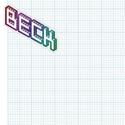


The band who has this cover is called Beck. Also, the way that they designed this CD cover is interesting because instead of actually desinging one, they have put stickers on the inside for the buyers of the CD to decorate their own cover. It really isn't the most interesting covers to look at because it is only Graph paper, which could remind people of the old fashioned graph paper that they could have used at school for Maths lessons or aiding their drawing. This also gives the people who buy this CD the opportunity to create something that they can relate to or something that they would enjoy to look at at they got out the CD to put into their player. It would be something that would ideally suit everyone but I think that this idea has been marketed wrong because it wouldn't generally appeal to the main target audience as they wouldn't know what to do and they could just end up letting their kids (if they have any) rip it apart. It also generally appeals to those Becks' fans as it relies on their understanding on what to actually do.

Personally, I actually like this idea of being able to decorate the cover as you see fit and how it would suit your own way of designing what you would like to see on your own shelf, although I think this idea has been marketed wrong because people would just glance over it because there is nothing on the back, it's just a sheet of graph paper.

The Chemical Brothers - Push The Button


The Chemical Brothers are a big beat dance group who aim their songs at people who are into Big dance tracks. The front cover is made of Typography (Push the button) and the words are used as a squiggle for the brain. The first also helps form the brain and it balanced on a tower of bricks. This is a similar construction to Russia where it's symbolises power and it doesn't use many colours because power tends to not use many colours because you don't want to put people of when trying to gain power. 
The Bricks remind me personally of a chess piece (The Castle) which then shows that the fist is coming out of the top of the tower of the castle and therefore shows strong power. However, there is cracks in the wall to show deconstruction and destruction within the walls of power and the walls of the building. 
On the back of the CD cover there are the song lyrics which are placed around the design of Cogs, showing the mechanics of the songs and maybe what they are trying to say what their songs mean about power and maybe about Communism. In addition to the songs that are on the back of the CD itself, they are also listed on the inside of the cover, to make sure that no one forgets their songs, especially since they are in big letters. This could just be to make them more easy to see an many people don't look on the inside cover so it could come as a shock to them when they see a list of songs on the inside as well on the back as the back cover is where generally people look at mainly to see what good songs they have on the CD. The designer is unknown.

Personally, I don't like this Cover because it is too dull for me because there are no colours to the cover and I like to look at something that would capture my eye as soon as I look at the self for CD covers. It was 

Blur - The Best Of Blur


This album cover is for the Band Blur and represents the sound track of The Best Of Blur. This band is an Indie, alternative rock band and would most likely appeal to this sort of area and the many Old fans that are still around and remember this band. The cover is designed by an Illustrator called Julien Opie and in the style of Pop Art, with the four band members cartoonized and simplified in a way and also, they have been put on different backgrounds. The name of the band has been placed into the middle of the page and also the name has been embossed. 

This sort of design is a nice simple one to do yet effect because you can combine different images into one and also it is a effective because you can put different personalities into one cover and it would all manage to fit into the same sort of genre because the cover helps make it work. This is also would make it stand out on the shelves because modern covers have REAL pictures of the bands/ artists on the front and this just makes it stand out because generally artists like to be at the front in the limelight instead of being personalised in a 'cartoony' sort of way.

I like this design because of the simplicity it has on it and also, I like the way that it's just four pictures and that they are the same size. It is also simple because of having a really simply font in the middle of the CD cover, yet it works well because of the style of the font being a curvy sort of text.


Tokio Hotel - Scream


The album is Scream by Tokio Hotel who are a german band but do their songs in both English and German. Also they are a alternative rock band and I found them through a friend who was a really big fan of them and she introduced me to their music. I could not find out who designed this cover but if I was to look at the cover properly, I could possibly find out from the list of credits that are on the back cover. This cover could have been created by using a professional program that could help incorporate the cover come together.

By using a professional program, the designer could have taken a photo of the band in a specific pose and then take that, then using the pen tool to outline the band or the magic wand tool to take out the background in the other picture and then Copy and Paste the band into a ready done background with a lens flare sort of effect in the background and then made the text in the foreground with the bands logo and the word Scream with a light effect.

This is a really nice effect to do because it's simple and it could just mean a sort of layering issue with two completely different backgrounds and bands used. For example, if I was to do a album cover using this idea with Ed Sheeran, I could get an easy picture to do, like cut him out or using the magic wand tool, I could then get a picture or a simple background with a nice pattern on it and then paste Ed onto this layer and then editing and styling the picture to how I think that it should look.

I really like this way of styling and it works really well for different types of music and I would certainly give this way of doing a CD cover a try and see what the outcomes are.


Sunday, 17 June 2012

Typography Portraits


These are examples of the Typography Portrait text and I think that this work is amazing to look at because it shows the lyrics of the artist that it is representing. For example, Rihanna had her portrait done and I think that it's quite effective. The idea of this was that the artist was told to tell them a song title of one of their own songs and then produce a list of songs that are used as inspiration to them and then the designer used this to add list of songs which built up their portrait. One song that seemed to have inspired Rihanna was Survivor by Destiny's Child. 
These portraits were done by a company called TBWA\Chiat\Day who were hired by The Recording Company to create a series of these posters for the 51st Grammy Awards. They were made generally in the Year 2009 for the February event that took place. 
To understand how this was created, I first of all looked at different posters of the same technique and found that for different people, there were different outcomes because of simply their chosen portrait and I think that the different looks to the posters work really well and I feel that working with text looks better rather than drawing and line-making with a simple pencil or programme that uses lines to draw with and also using a range of colour for this text works better than using one simple plan font because it adds a 3D look to it and also helps the poster have depth that would intrigue people to look at it and find all the songs that they may know. I looked at a simple tutorial to see if I could do something similar in this style of work and my outcomes are below. I like the way that they have mainly turned out because they seem to be almost in the style of what I have seen and I think that with more practice, I could end up with something really close to the examples above.


Ed Sheeran - Lyrics from 'Drunk'


Justin Bieber - Lyrics from 'Boyfriend'


Muse - Lyrics from 'Uprising'


Bruno Mars - Lyrics from 'Grenade'


These portraits that I have done have turned out really well  as I felt that during the process of making these portraits using lyrics from their songs, that I was using the wrong steps and that I was missing a step or a layer because the program I used was Adobe Photoshop.Also I like the effect that this has, it is like the words have wrapped themselves around the picture of the artists so that they are embedded within the shape of the picture itself. 
I would enjoy making this sort of design because with Photoshop, you can use pictures with a plain background and change the text layer to a range of colours that you like and then be able to make out different parts of the artists/ bands faces that you want to show in great detail. The best backgrounds to work with are mainly Black or white and the picture preferably has to be in colour that way you get the best results because otherwise the background really interferes with the picture itself, like the example below. However, I like the way that the picture can be defined with a black soft brush and picks out the different aspects and makes it look like it's been drawn with different variety of pressures.


Foster The People - Lyrics from 'Pumped Up Kicks'


Friday, 15 June 2012

Billie Jean inspiration


Billie Jean Nike Promotional advertisment
This is an Advert poster that is done by a famous illustrator called Billie Jean and it's seems to be in a style of 'Controlled' messy where, he knows where he wants to put everything so that it looks like it was done randomly but, it could have been planned that way so that different people see different things in the picture at any one time so that they can see what stands out the most. There are many different icons in this picture that could represent many different areas where this shoe could have been sold. Also, another icon is doing a drawing in Biro ink, which makes the poster more aimed at Teenagers who wear branded items, such as Nike, who randomly doodle all over the pages that they could be given at School/ College/ University and like to create their own pieces of work that could mean one specific thing to them but to others who look at it, see a totally different image because of the what the person looking at the poster looks at first. Clearly in this poster we see the Shoe first because even though it is not in the middle of the page, it is the biggest drawing on the page and the darkest, making it the main focus of the advert.


The word 'Vandal' written in block letters with a bold background also is the next thing to stand out to the viewers eye because of how the word 'Vandal' can relate to the badness of how teenagers can act when defacing property and this just helps prove that this poster is for them because the poster is basially vandalizing a piece of paper that could have belonged to someone else, if it was in school and the paper was given to you by the teacher etc. This is just one meaning that could come from the word itself, but there are many that are present with the word 'Vandal.' Because, when doing my research, I found that it was a campaign that Billie Jean participated in, possibly in 1985 which is stated underneath the word 'Vandal'. 


The images surrounding this shoe, are major elements because it helps define the target location of the poster. For example, the use of the 'Peace' Sign at the bottom looks like to be a emoticon that is used in conversations or online social network and the main place for conversation/ Social networking is in the Urban City and not in the Rural Countryside.  Also, the many basketballs are placed all over the page, and this could signify that the sport is played all over and generally in places of busy pedestrians or teenagers with an interest in basketball, there would be a basketball court open to them and that is generally in the City. An idea that it could be British aimed, but we have no proof, is that the 'Peace Sign' is facing the wrong way to be American because in America, their 'Peace Sign' is the way that in Britain means swearing to one another. Also, we can see the fingers in the 'Peace Sign' and therefore relate that to British Isles instead of America where basketball is generally played.


This leads me onto the next point is that this poster could also promoting the sport in Britain because instead of Football being the leading sport in many peoples lives, basketball could become another watched/ played sport in Britain and therefore wanting to help people get into the basketball community with a new pair of shoes that look sporty enough to play basketball and still look fashionable.


My opinion on this piece of art work is that it's interesting to look at and see what meanings I can dig out of this poster but I personally wouldn't go and buy them because they aren't for me because I generally don't play sport but I know people who could go and buy them because of the way they look. I think that the art work is unique because many artists wouldn't want to do a 'Controlled' messy look for the artwork and they would prefer their work to be in order. I would consider doing a similar thing to this if I had the confidence to just place things wherever and outlined things that I want to stand out.


My idea done in the style of Billie Jean using pencil
This is my version in the style of Billie Jeans work. I did it all free hand and in Pencil because I don't like working in Biro or ink because it can get messy because sometimes when I brush my hand over the work it smudges and then I feel bad because I've just messed up something that could have looked really nice and good on the piece of paper. I used song lyrics of a few artists that I could use (Ed Sheeran - Drunk, Justin Beiber - Boyfriend etc) and I feel that using the song lyrics and load of differently drawn images relating to music itself created a nice effect and I tried using a similar effect of Billie Jeans writing when writing music, drawing in box-style to create this 2D look for writing.

If I was to do this exercise again, I would use a smaller piece of paper to give me less space to work with instead of a big space that I need to fill. Also, I could then try to overlap some images to give the 'controlled' messy look that Billie Jean has managed to create in his advertisement.